Week 9 - 11
During the last three weeks (Weeks 9-11), I have been focused on improving my dissertation project in preparation for the upcoming open studio in Week 12. Specifically, I have been working on refining my original idea to create a more cohesive marketplace environment, as well as enhancing the visual and functional aspects of the user interface (UI).
To achieve this, I have been actively refining the different spaces within the marketplace to ensure that they complement each other and form a cohesive whole. This involves considering factors such as the layout, color scheme, branding, and overall user experience. Additionally, I have been exploring ways to make the UI more aesthetically pleasing and user-friendly, such as through the use of clearer and more intuitive navigation menus, buttons, and icons.
How to make the spaces look more cohesive with each other?
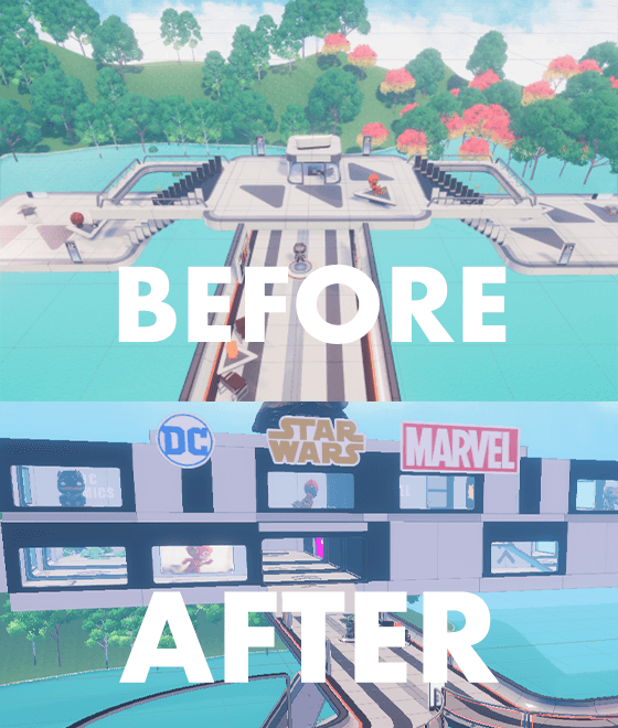
Superhero space
Originally, my vision for this shop was an open-air concept. However, after receiving feedback that this layout could potentially be messy and not as cohesive, I decided to make some changes. Hence I recreate the shop as a more traditional retail space, with a cohesive design and branding that would better fit with the other shops in the area.
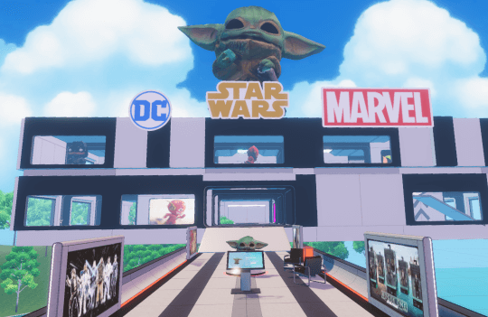
To achieve this, I have chosen to go with a black color scheme that represents all of the heroes from popular collectibles like Star Wars, DC Comics, and Marvel. This will give the exterior of the shop a sleek and cohesive look that will stand out among the other nearby storefronts. Additionally, I believe that the new design will be better suited for incorporating clear and aesthetically pleasing signage, which will further enhance the branding and overall shopping experience for customers.

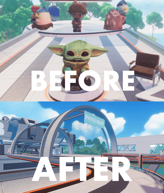
General collectibles space
During my dissertation, I initially envisioned the shop as a space for general collectibles, where people could buy collectibles through a gacha system. However, I realized that this layout was confusing for users based on their feedback. As a result, I decided to make changes to the shop's design to improve the shopping experience and make better use of the available space.
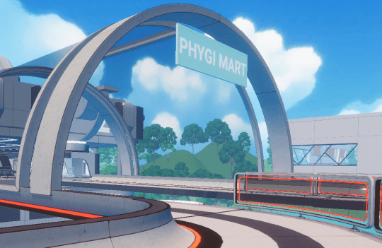
I renamed the store "Phygi Mart" to reflect its focus on collectibles, and redesigned the layout to create a more cohesive and intuitive shopping experience that aligns with neighboring stores. I decided to use the space to display products in a more organized way. I also added clear signage to help customers navigate the store and find what they need with ease.
The new indoor concept of Phygi Mart makes it a one-stop-shop for all kinds of collectibles, with a focus on providing a seamless and enjoyable shopping experience. By improving the layout and signage, I am confident that customers will find the store more welcoming and easier to use.
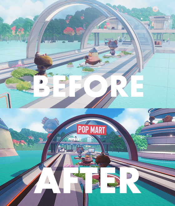
Popmart space
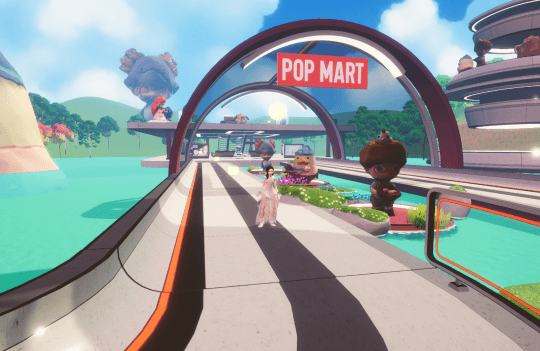
I've made several enhancements to the layout of the shop to better represent the Popmart branding and create a more engaging and fun experience for the customers. I've introduced a bold red color scheme throughout the space, which immediately catches the eye and reinforces the brand's identity.
To create a more playful and enjoyable atmosphere, I've continued with the open-air concept and avoided enclosing the space. This allows the customers to feel more connected to the surrounding environment and to enjoy the natural light and fresh air. I've also added more decorations such as quirky posters, and eye-catching displays that showcase the products and add to the overall sense of fun.
As you can see from the before and after photos, these changes have significantly improved the branding and appeal of the shop, making it a more inviting and exciting place for customers to visit.
Moving forward
There are some challenges that I had to overcome while designing the layout for the metaverse. Two of the most pressing issues were texture memory and the overall size of the virtual environment. One approach I took was to combine the customisable ability of Unity with the accessibility of Spatial. This allowed me to customise the environment in Unity and then beta test it on the Spatial website. While this approach offered some benefits, it also came with some limitations. For example, I could only use certain plugins and scripts for animations due to the restrictions imposed by Spatial. This required me to be creative and find workarounds to achieve the desired results.
Another challenge I faced was the 500mb limit on the size of the virtual environment that Spatial could accommodate. To ensure faster FPS, I had to resize all the objects in the environment to a smaller size. This was a time-consuming task that required a lot of patience and attention to detail.
How to improve the user interface (UI)
In this section, I will discuss the various design elements incorporated in a virtual world, including the UI and advertisements collaborations with brands such as Popmart, FunkoPop, and Marvel. The UI was designed to be intuitive, user-friendly, and visually engaging, while the ads were tailored to specific audiences and platforms. The overall focus was on creating a seamless and immersive experience for users.
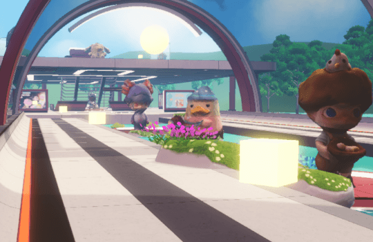
Guiding path
The cube serves as a guiding path for the user, enhancing their experience and directing them to their desired location. Without this cube, users may feel uncertain about where to go when they first enter the world. Through user testing, we found that users were able to navigate the world easily without much explanation, thanks to the cube. This interesting observation helped us improve the user experience. People often complain about getting lost in the metaverse, so it's important to design in a way that relates back to the familiar layout of the physical world. By doing so, users can feel more at ease navigating the virtual space.
Directory board
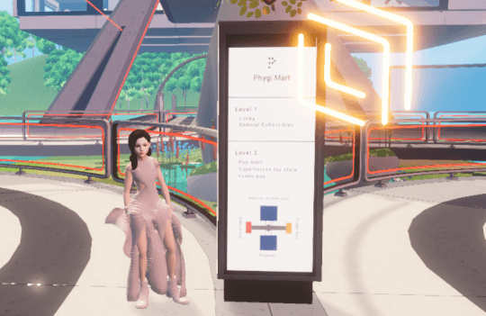
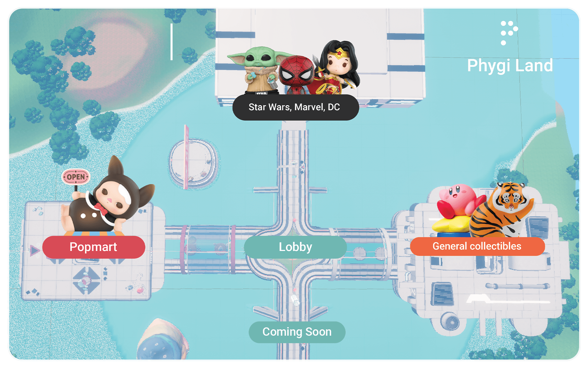
When creating a metaverse, having a directory board is essential to help users navigate and find stores. The directory provides information on store locations, such as Popmart on the north side, Superheroes on the east side, and General Collectibles on the west side. Currently, the south side is empty. Initially, I started with these few stores to kickstart the project, and as it progresses, there will be more changes made. Having a directory board ensures that users can easily locate their desired stores, making their experience more enjoyable and efficient.
Product UI screen
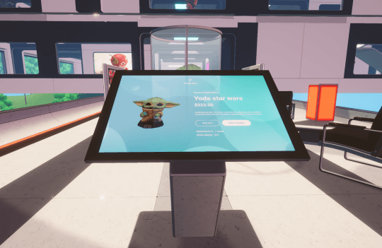
This is a mockup of the product UI screen, which is intended to allow users to purchase collectibles and view in 3D form. However, due to restrictions of using Unity but hosting on Spatial, direct purchasing from the server is not possible. Nevertheless, this demo gives an idea of how the screen looks like and how it will function during a purchase. During user testing, users found it easy to know where to transact, but it was difficult to visualize the process as this is only a demo. To address this, I plan to create a video explaining how the purchasing process works, to provide a more comprehensive understanding for users.
Advertisement banner
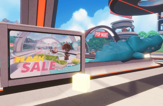
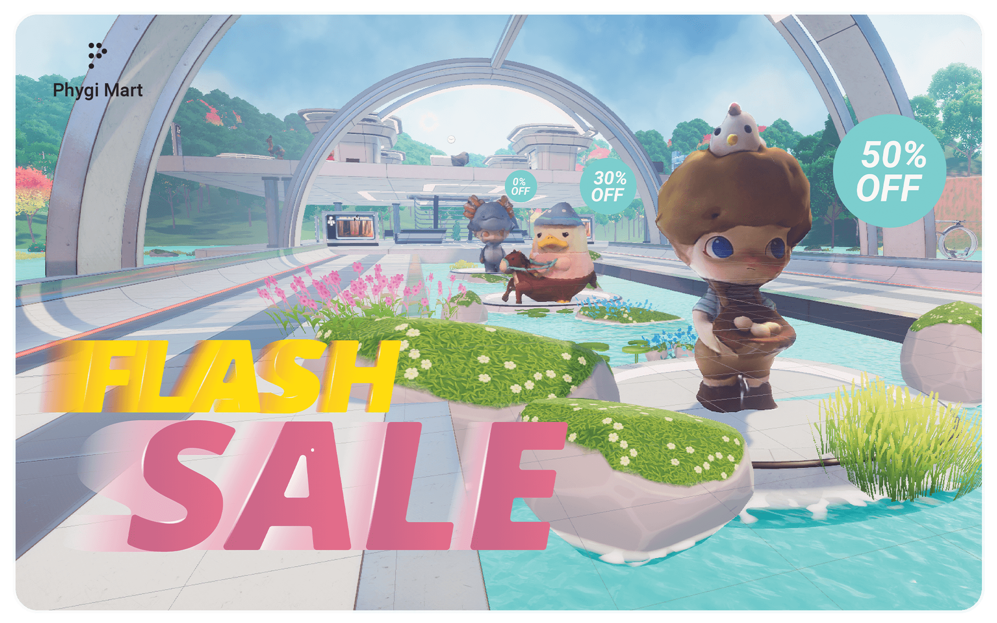
As shown in the picture, I designed various advertisement banner to increase customer traffic, promote products, and grab the attention of potential customers. For instance, before entering the "pop mart" space, users can view advertisements showcasing the best-selling collectibles. These banners effectively capture the interest of users and entice them to explore the products being advertised.
Floor plan
For the floor plan, I have decided to place in this format because I feel that it is the best layout. As discuss earlier, the floor plan follows a shopping mall layout concept known as the "dumb-bell" design, in which larger stores (anchors) are positioned at opposite ends of the mall to act as attraction points for customers. There are three categories of stores in the layout of our designed digital space: General Collectibles, Popmart, and Superheroes. The user starts at the central lobby and can choose to head towards one of the three stores on the left, front, or right. The design allows for easy access to any direction, without the need to go through one shop to reach another.
Storefront layout for week 12
While there are some areas that could be improved, I've decided to stick with the current design for week 12.
Superheroes Space
I have placed collaboration logos at the top of the building's façade to give visitors a glimpse of what they can expect when they enter the superhero space. A gigantic Yoda figure sitting on top of the roof, adding to the excitement and providing an immersive experience that cannot be replicated in real life. Additionally, the building's architecture features a see-through design, allowing customers to catch a glimpse of the figurines from a distance.
The building is spread across two floors. The first floor exclusively houses Star Wars characters, while the second floor is dedicated to Marvel and DC comics. I decided to create this space because many of my friends are avid collectors of superhero figurines. Based on market research, I have identified a unique category of superheroes that collaborate with DC Comics, Star Wars, and Marvel. By curating these space can create an immersive experience for visitors, I hope to create a one-of-a-kind shopping destination for superhero fans.

Popmart space
My second space is designed to capture the playful essence of Popmart branding. I've incorporated a vibrant red color scheme and an open-air concept that allows visitors to enjoy the art while connecting with nature. This unique experience cannot be easily replicated in real life. For example, I've placed figurines on water, creating an illusion of floating that adds to the fun.
This space is all about creating a joyful atmosphere that appeals to art lovers and collectors alike. The open-air design encourages visitors to engage with the artwork in a relaxed setting, surrounded by natural beauty. By bringing together art and nature, I hope to create an unforgettable experience for everyone who visits this space.
Phygi mart Space
My third space, called Phygi Mart, is dedicated to showcasing general collectibles that are popular among collectors. From FunkoPop to Emma and Sanrio characters, this space offers something for everyone. The design of this space is tailored to accommodate different types of figurines, allowing visitors to explore a wide variety of collectibles in a single, enclosed location.
Unlike Pop Mart, which is designed to be a fun and playful experience, Phygi Mart takes on a more cyberpunk-inspired aesthetic. While it may be less fun-focused, the futuristic design adds to the overall atmosphere of the space and enhances the experience for visitors.
Reflection & feedback
It took a lot of effort and time to conceptualize and design these spaces, but I'm thrilled to have found a way to reach a wider audience by hosting them on Spatial. While this platform allows for more people to join the virtual world, there are limitations, such as the inability to make purchases within the game. At the moment, the world is only a demo, but I'm constantly gathering feedback from users to improve the experience.
During week 12, I will continue to gather feedback from a diverse group of people and conduct user testing to understand their preferences and user journey. This information will help me refine the design of the world to enhance the overall experience. While the spaces haven't been fully developed yet, I'm excited to continue working on them and bringing my vision to life.
